Products
Solutions
Resources
9977 N 90th Street, Suite 250 Scottsdale, AZ 85258 | 1-800-637-7496
© 2024 InEight, Inc. All Rights Reserved | Privacy Statement | Terms of Service | Cookie Policy | Do not sell/share my information

In Explore, you can edit the standard dashboards in order to create new custom dashboards and visualizations by modifying standard dashboards to meet the needs of your project. You cannot create dashboards from scratch, but you can edit the standard dashboards and save them as new custom dashboards.
The following steps walk you through how to edit an existing dashboard to create a new dashboard.
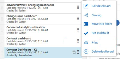
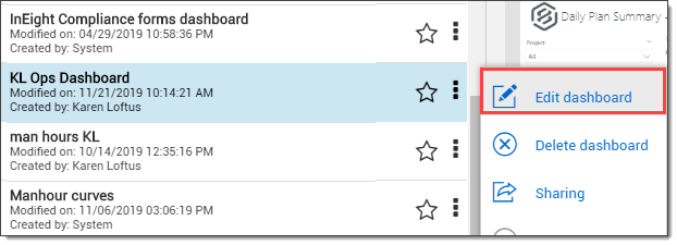
Select Edit dashboard.
The Visualization and Fields slide-out panels open on the right side of the screen.
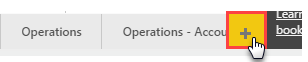
Click the New page icon to add a new tab.
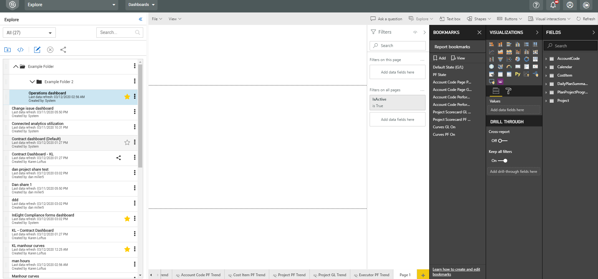
Your screen will now look something like this
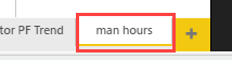
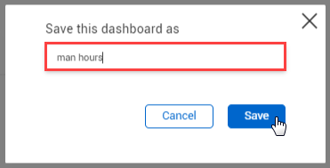
Double-click on the default page name and type in man hours.
Your tab will now look like this:
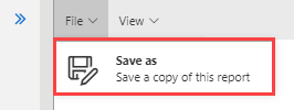
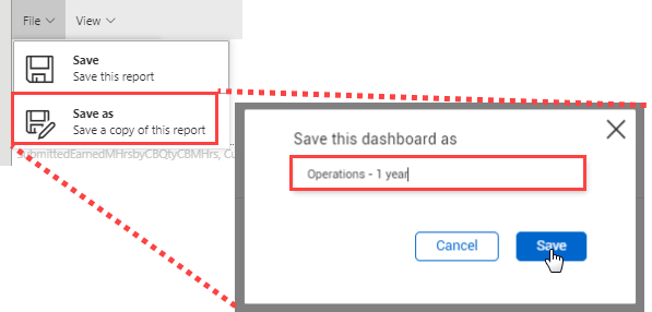
From the drop-down menu, click File > Save as.
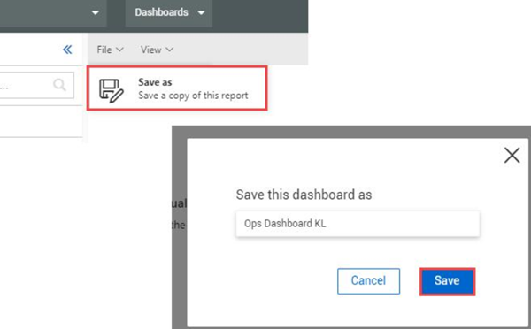
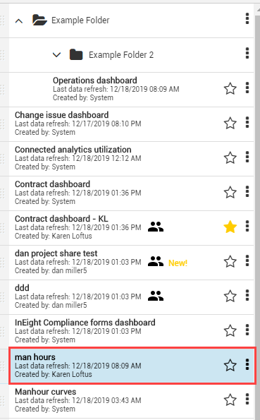
In the dialog box, name the custom dashboard, and then click Save.
From the Visualizations and Fields slide-out panels, you can add chart, graph and card visualizations to your dashboard and populate them with the appropriate data fields.
You cannot change the data source for the dashboard. The dashboard comes pre-connected to a dataset you may use to edit or add visualizations and filters.
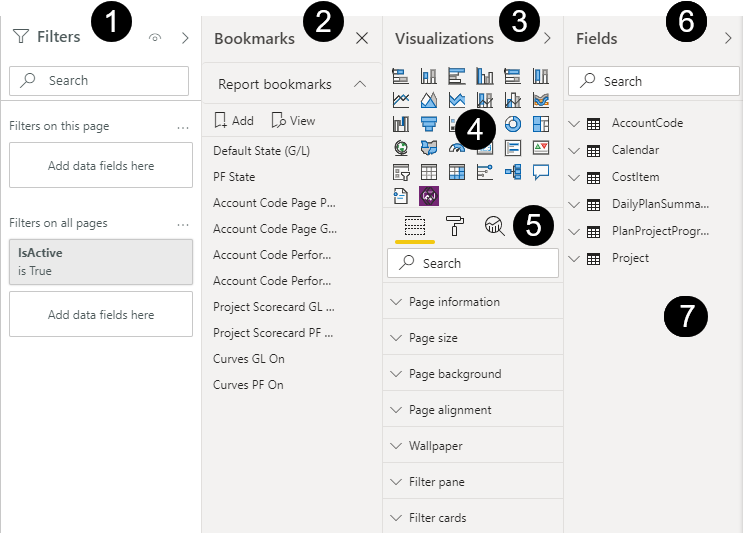
Visualizations and Field slide-out panels are utilized for the following unique purposes:
| Term | Definition | |
|---|---|---|
| 1 |
Filters slide-out panel |
Various ways to cut the data using selections from the Fields slide-out. |
| 2 | Bookmarks slide-out panel | Customizable saved dashboard views to quickly access frequent dashboards. |
| 3 | Visualizations slide-out panel |
Charts, Graphs, and Cards selection for dashboard tab. |
| 4 | Charts/Graphs | Various charts, graphs, an PowerApps for PowerBI. |
| 5 |
Fields, Format, Analytics |
Format provides page information. Fields allows for adding value data fields and drill through capability. Analytics modifies the lines (min, max, average, etc.) shown in the selected chart or graph. |
| 6 |
Fields slide-out panel |
Contains data fields to add to your visualizations to report on in your dashboard. |
| 7 |
Data Fields |
Data from InEight Project Suite to add to fields such as Axis, Legend, Values, etc. under the Visualizations slide-out panel. |
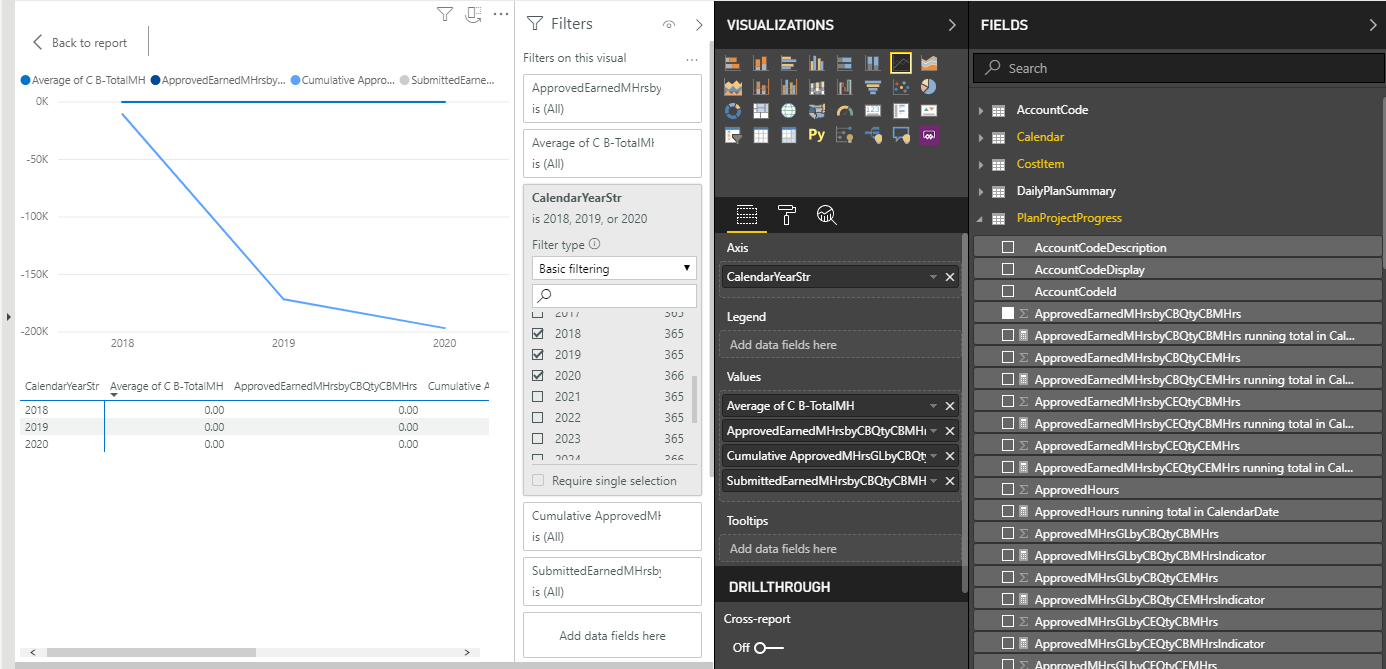
The following Step by Step walks you through adding a graph visualization to your dashboard reporting on Project Progress and man hours.
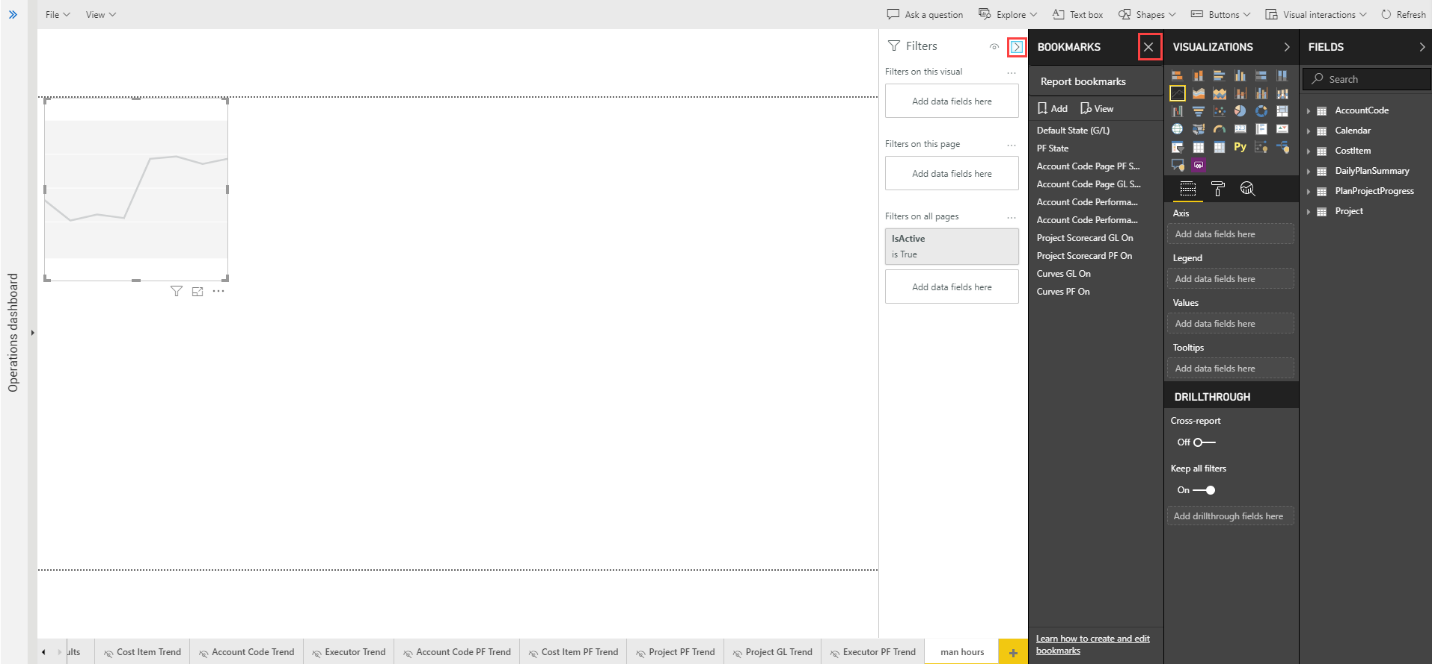
Under the tab you created in Step by Step above, on the Visualizations slide-out panel select the Line chart  visualization.
To make more space, hide the Dashboards slide-out panel, Filters slide-out panel and close Bookmarks.
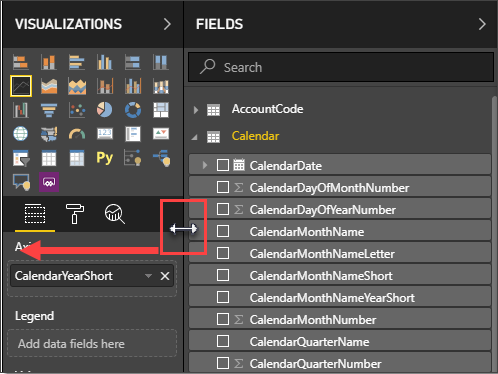
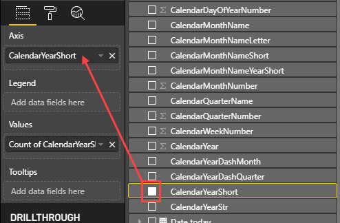
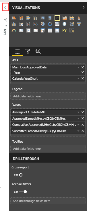
Under the Fields slide-out panel, navigate to the Calendar and click the CalendarYearStr check box, and the selection will populate in the Axis.
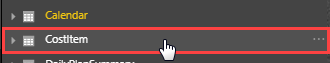
Close the Calendar Field and scroll down and open the CostItem Field side arrow.
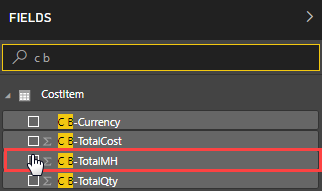
In the Search bar under Fields type C B-.
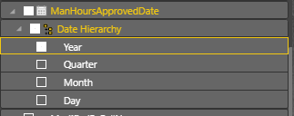
Open the Daily Plan Summary Field and select ManHoursApprovedDate. Modify the Date Hierarchy to match this:
Open PlanProjectProgressand select the following fields:
SubmittedEarnedMHrsbyCBQtyCBMHrs
By clicking each Values drop-down fields, you will see each is intuitively using the mathematical sum function.
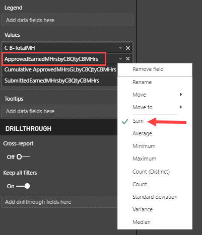
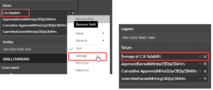
On the C B-TotalMH drop down, change the selection from Sum to Average. Notice how the field name changes.
Open the Filter slide-out.
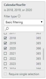
Expand the CalendarYearStr field by clicking on the drop down. Using Basic filtering, select years 2018, 2019 and 2020 to abbreviate the reporting years chart.
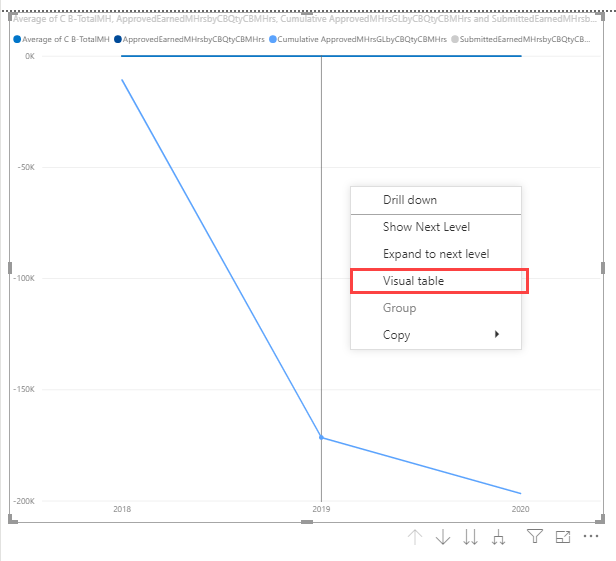
Right-click inside your chart and select Visual table.
Click < Back to Report.
There are two ways to save a dashboard.
First, if you are leaving a newly created report where you have modified data, you will receive a pop-up where you can confirm your desire to save your change.
Click the File > Save As drop down.
If Yes in selected, save with a new dashboard name and click Save.
Alternatively, if you are leaving an existing report where you have modified data, you will receive a pop-up where you can confirm your desire to save a copy of your change.
Click the File > Save As drop-down.
Add a name for the new dashboard and click Save.
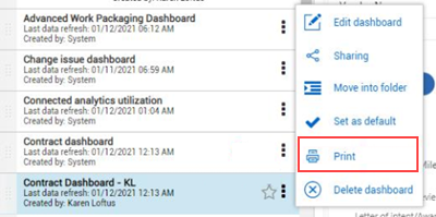
To print a dashboard, select the three dot ellipses next to a dashboard you created.
To determine what fields are in a given report, click the Report, look at the Fields pull-out, and open the yellow colored drop-down. Search through the listing for the field(s) with a solid check-box.
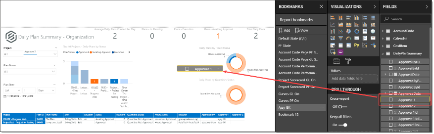
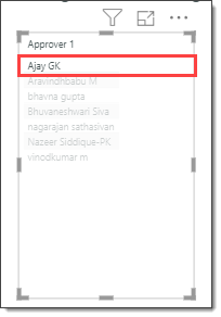
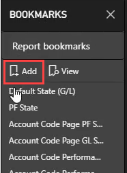
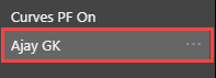
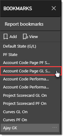
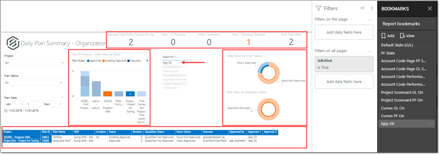
From an edited dashboard, you are able to further personalize your dashboard by adding a new field. In our example, Approver 1, Ajay GK is a frequent approver. We want to quickly view projects specific to him. We will do that by adding a new field onto the dashboard then adding a new Bookmark tied to him. That way, we can quickly see that view as easily as the default mode, or by clicking on other default Bookmarks. Let’s see how we did it.
Ensure you are in the Edit dashboard mode of a saved, renamed dashboard.
Additional Information
9977 N 90th Street, Suite 250 Scottsdale, AZ 85258 | 1-800-637-7496
© 2024 InEight, Inc. All Rights Reserved | Privacy Statement | Terms of Service | Cookie Policy | Do not sell/share my information